I decided to go full force into the redesign. I'd like to give credit to the inspiration for this design, but I can't remember where I saw it. I think I saw it fly by in my Mastodon feed, didn't think much of it at the time, but it got stuck in my head.
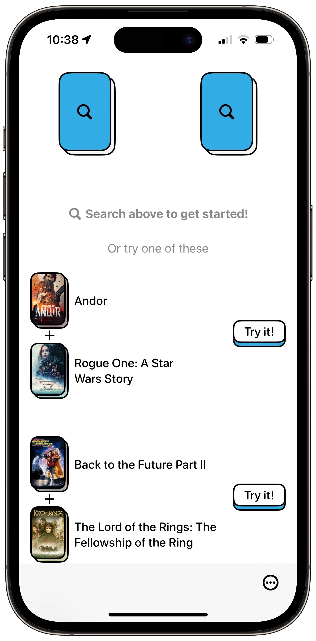
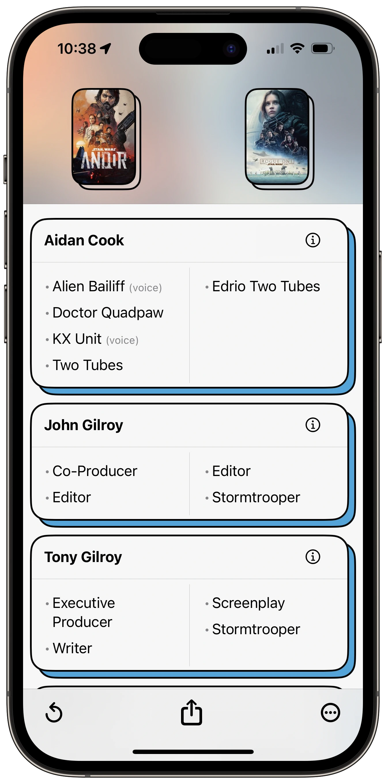
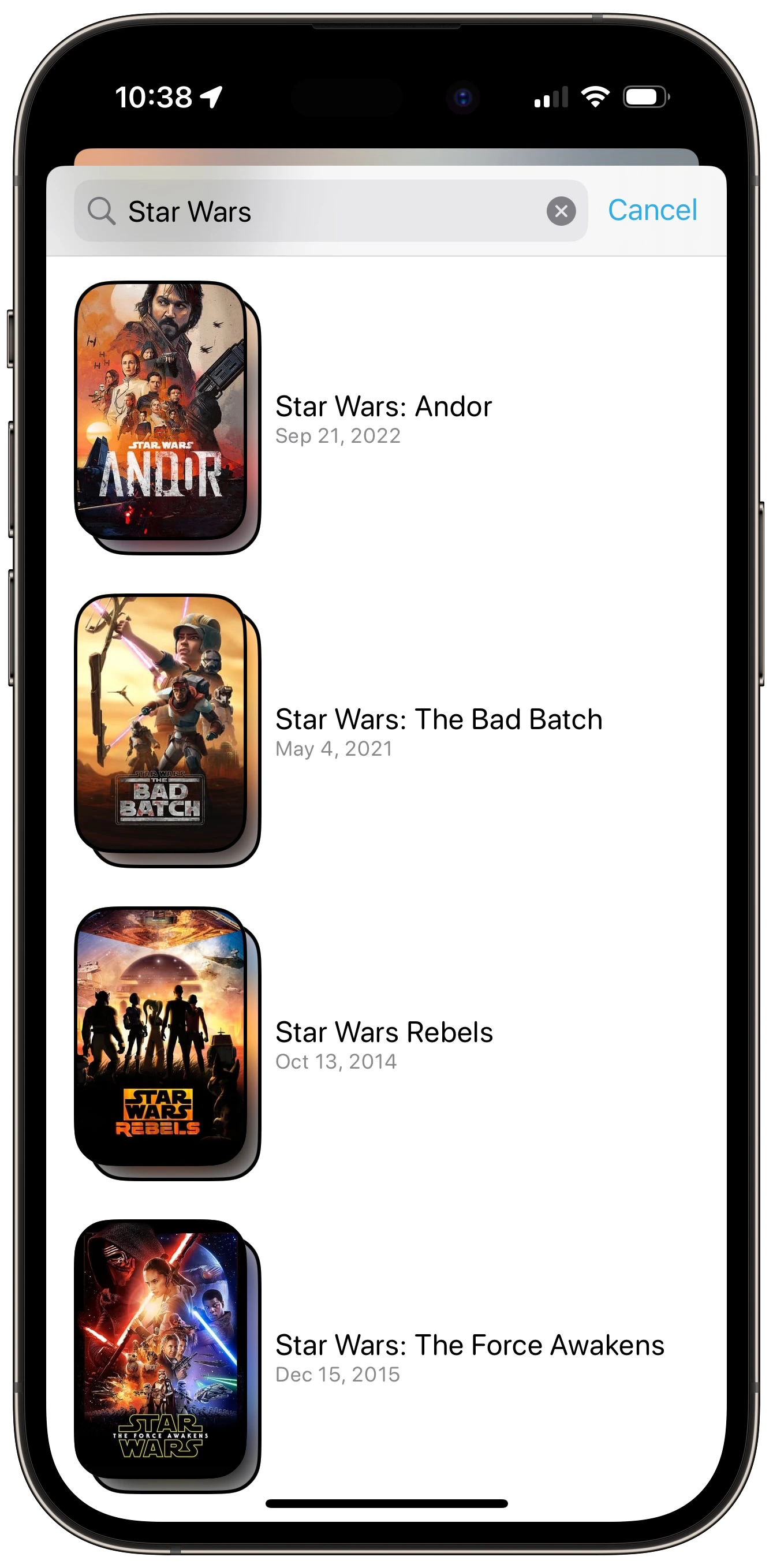
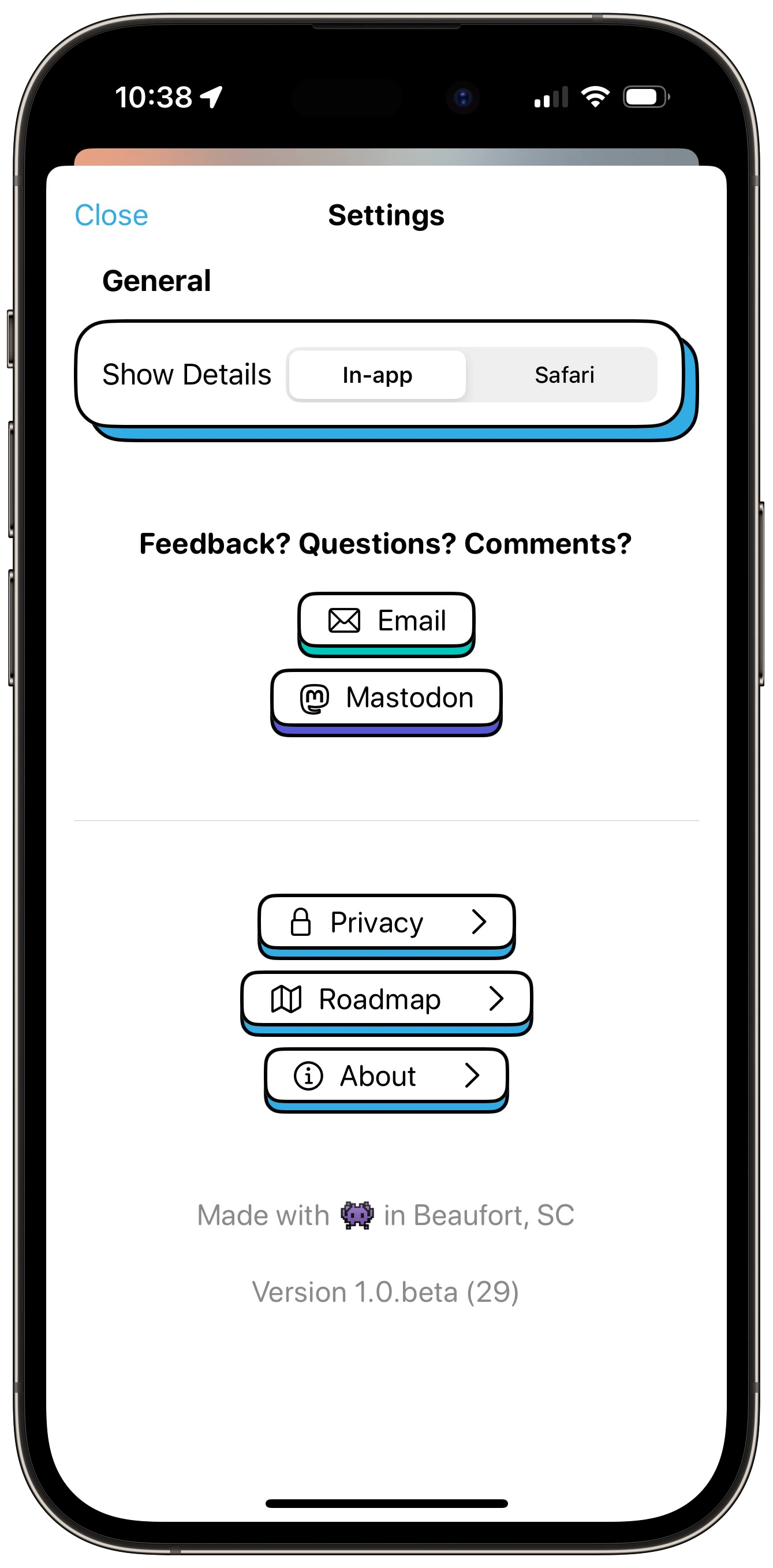
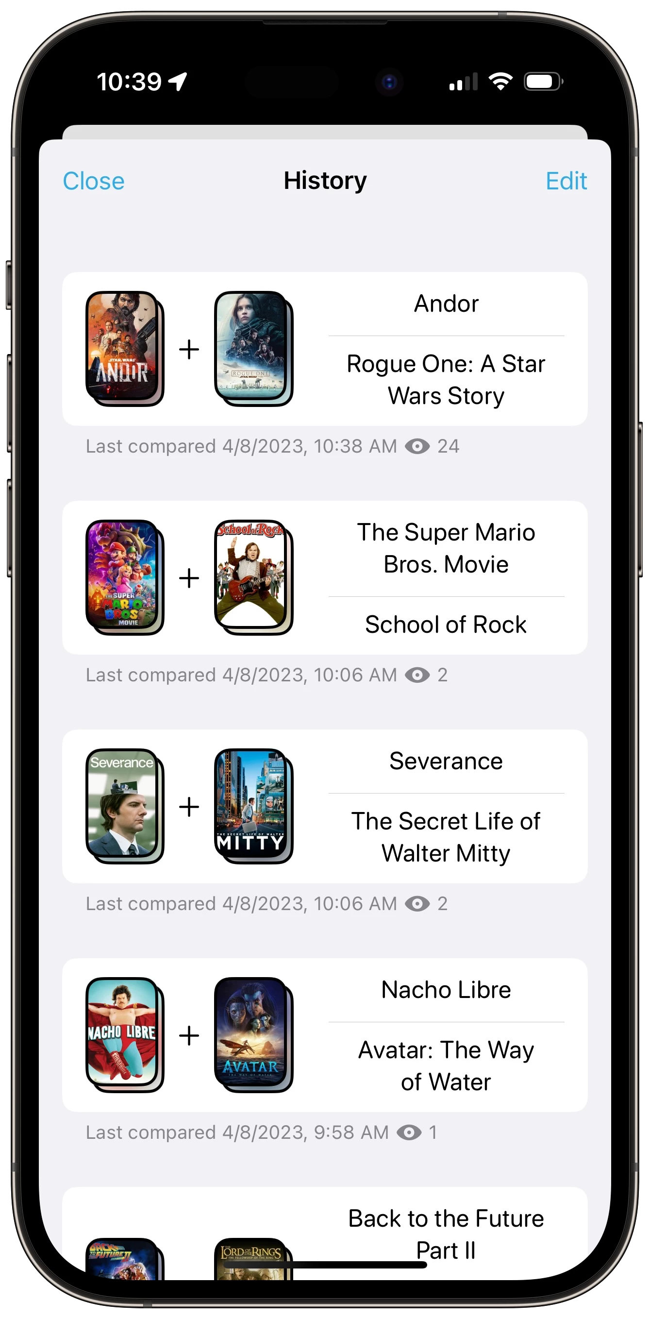
I like it. I feel like it adds some personality to the app. Still needs work. There's some spacing/alignment issues, and dark mode needs quite a bit of work.