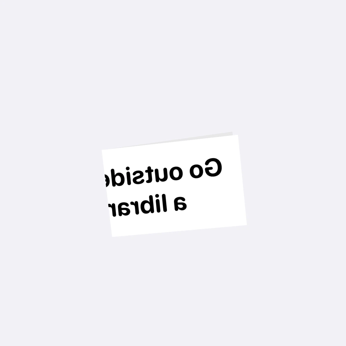
While at the beach yesterday, I had an idea for an interaction—a folded piece of paper.
It's made with a ZStack, with duplicate rectangles of text. One layer is masked to the shape of the left side fold and the other masked to the right side. This way they fit together when open, and then looks right when folded. Maybe not the best way, but this works pretty well!
Since the fold is not perfectly vertical, I had to break out a bit of trig on this to get the rotation correct.
.rotation3DEffect(.degrees(isOpen ? 0 : 175), axis: (-atan(2 / height), 1.0, 0.0), perspective: 0.8)When you rotate a view, it doesn't have a backside. So I had to do some guess work on the animation timing to change the opacity of the text so it's not 100% when folded. I need to look more into the new SwiftUI animation stuff to see if I can make it more exact. Basically, when the rotation is between 0° and 90° the text should be shown, otherwise, hidden. Well, mostly hidden. I want it show a little bit so it looks like it's on the back of the paper.

Going to keep playing with this, but I'm quite happy with it.