Been busy starting a new job this week, but I've also managed to get a couple things done in ScreenCred.
Profile pictures
This one was pretty straightforward, but I managed to complicate it.

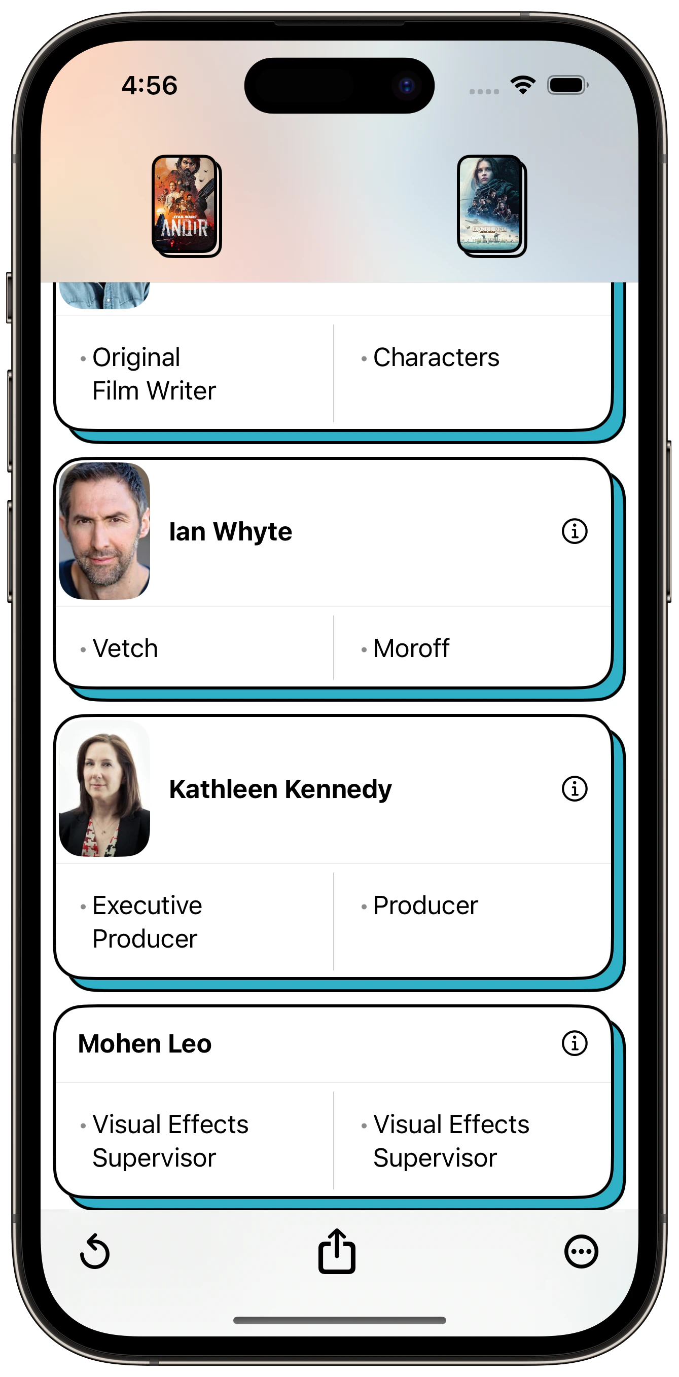
To fit the design of the app, I knew I wanted rounded corners. Matching the corner radius was a simple matter of maths. But I felt like they were taking up too much space. I think square was the way to go.

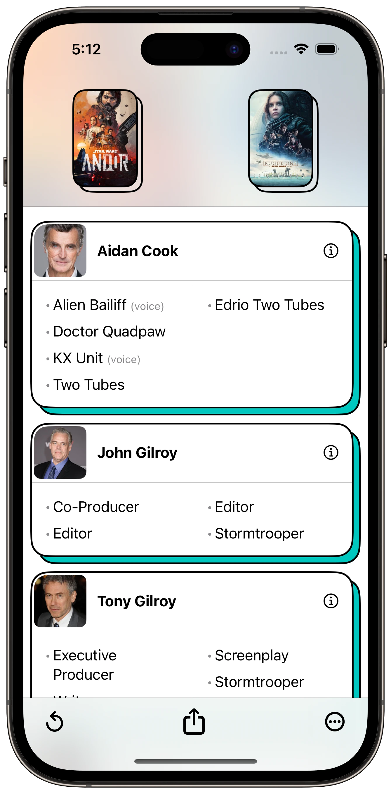
Next, I made them square. I like the spacing much more. I tried giving different corner radiuses to the outside corners. I'm surprised this is not a built in feature of RoundedRectangle. I kinda like this look, but don't love it. Then started thinking about adding a black border as well as how in the world I'd support RTL languages. So just scrapped that idea.

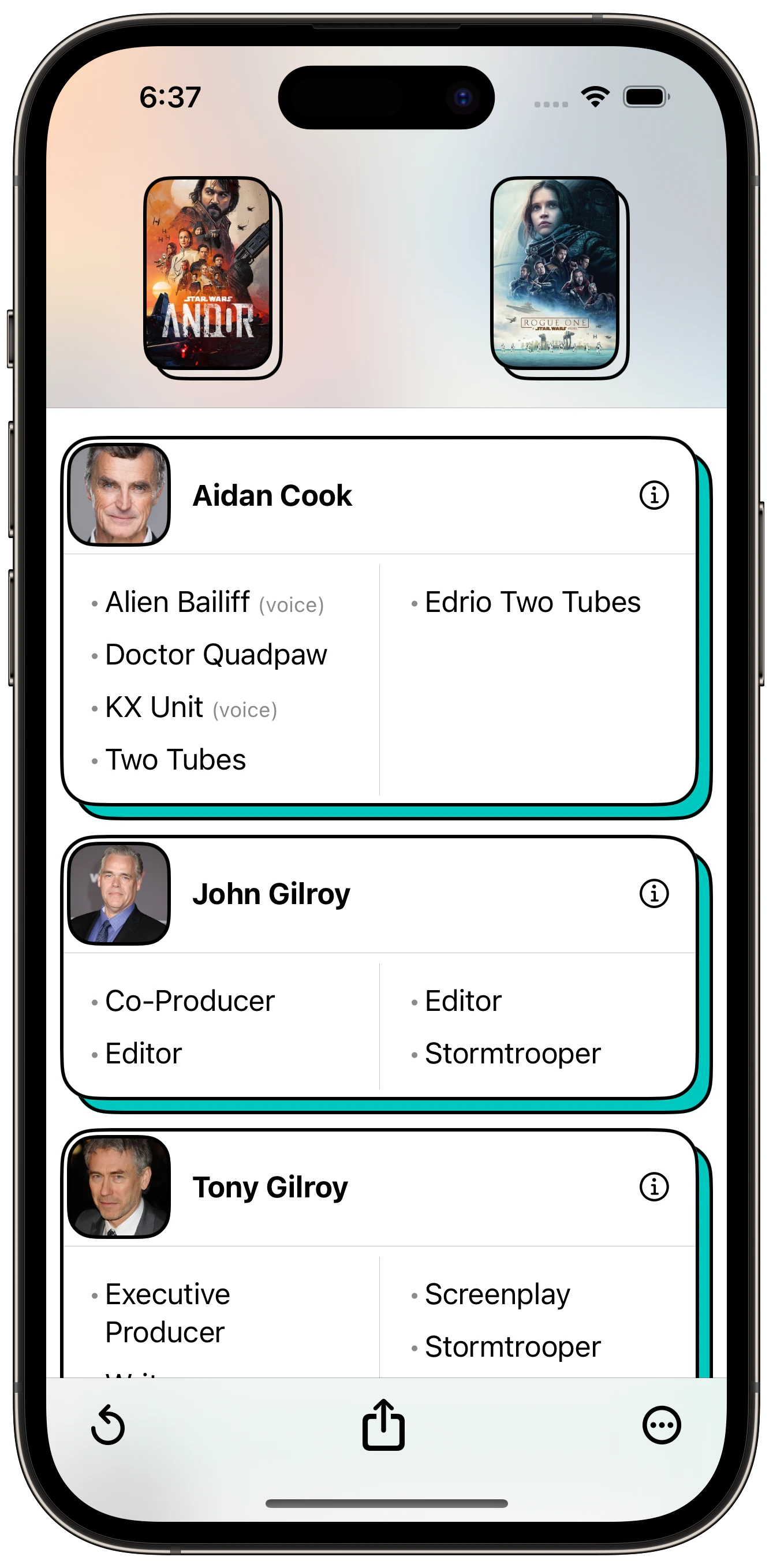
This is where I landed. Square, all the same corner radii, and a black border to make it match the design a bit more. Happy with it.
It's a simple change, but I think it makes it better having photos there when they are available.
The next thing I worked on was adding the ability to search people. I will write more about that tomorrow.