I worked on dark mode a bit today. I've written about it a bit before, but my eyes have a really hard with pure black dark modes with black backgrounds and white text. This is the default in iOS. So I wanted to do something a little different.
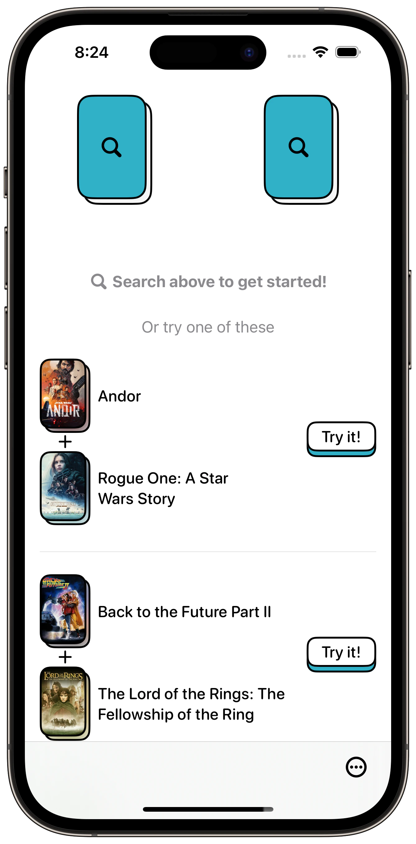
For reference, here is light mode:

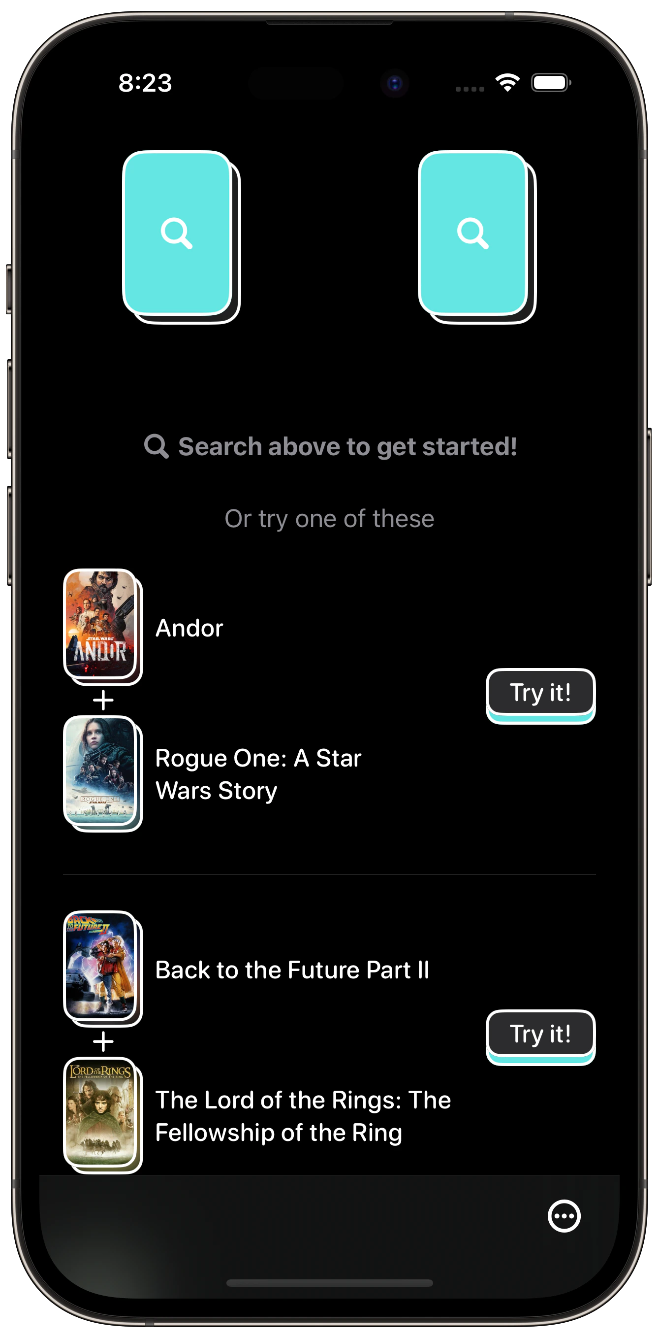
And here is the default, pure black dark mode:

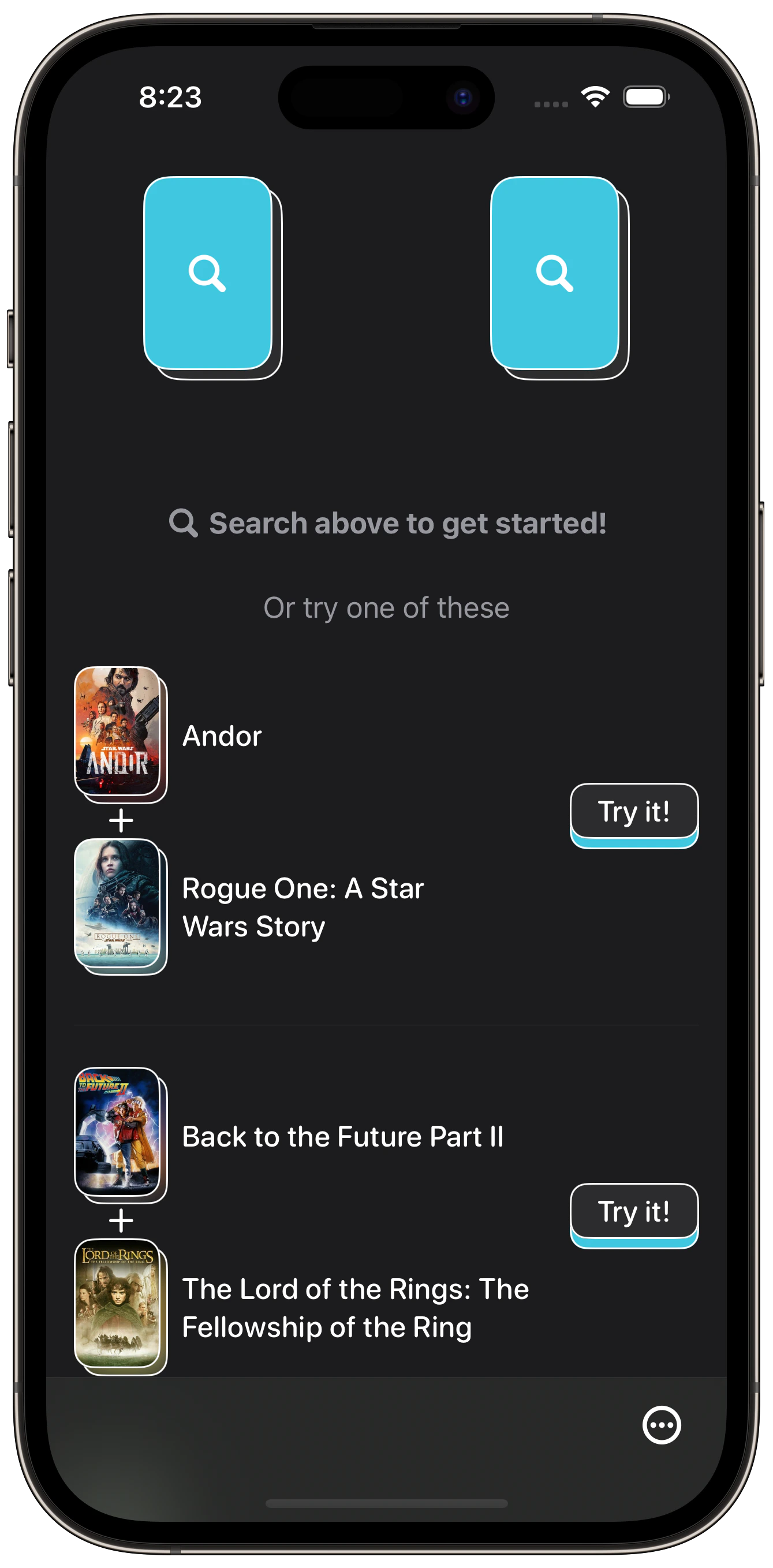
I decided to try replacing the black background with a dark gray. In this case, I used secondarySystemBackground. I also made the white borders thinner so they didn't feel so heavy. I think since the images are darkish, the borders stand out a lot more than the black borders do in light mode.

I like this a lot better. Gonna try it more on my device to make sure.
To accomplish this, I removed the content background from my ScrollViews and added my own background based on the current colorScheme. Not too bad.
ScrollView {
	...
}
.scrollContentBackground(.hidden)
.background(colorScheme == .dark ? Color(uiColor: .secondarySystemBackground) : Color(uiColor: .systemBackground))