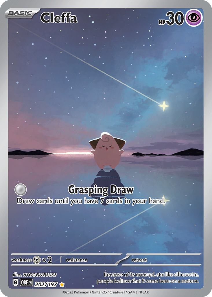
My newborn was taking an unusually long nap the other day. One thing led to another and I made a web component to help showcase some of the Pokemon cards I have been collecting.
Here's an example:

(You're viewing this post somewhere that does not support JS, like RSS. So this is not the actual component, just an image.)
I'm really proud of this component. You can use the mouse or your finger to move the card around. Tapping or clicking will expand it. I've spent so much time just playing with it. But it didn't start out this nice.
My first iteration of my /pokemon page was just a grid of images. I was first focused on getting the data.
I export the data from Dex—the iOS app I use to keep track of my collection—and then use the great Pokémon TCG API to get more data and images.
My friends told me this was cool, but pretty boring. Challenge accepted.
I posted about my new page on Mastodon and someone commented with https://poke-holo.simey.me. This is one of the coolest sites I have ever seen. Color me nerd sniped.
After digging through their code and site a bit more. The texture effects come from a lot of images and masks. I'm not sure how the images are generated or gathered, so I decided to simpler approach.
- Rotation based on mouse or touch position.
- Simple glare effect.
- Click to expand.
I decided to make a web component. My site is Eleventy, so I didn't feel like adding a whole other thing to make this. And I didn't want to disappoint Dave. The interface is simple, give it the URL of the card image and some alt text. It handles the rest.
To make things as performant as I know how, it's all based on CSS transform—scale, translate, and rotate. I update all those values with CSS custom properties in mouse and touch events. It's actually pretty simple and straightforward. The glare follows your finger or mouse, and then a slight rotation is added. Once you add perspective to the parent of what is being transformed, it looks 3D.
That was cool, but it was suggested to it should expand when you click it. This was the hardest part.
You think it would be simple—scale the image from current size to 90% of the screen height. The problem is, even if you're using a high res image, scaling up makes it blurry. The solution I landed on was to go the opposite way and scale down. I load the image full sized, then calculate the scale based on where I want it to be. For whatever reason, harder than it sounds, at least for me. So it might go down to a scale of 0.25 and then when you click on it, back up to 1 so you can see that beautiful high res image.
Also when you click on it, I calculate the translate necessary to move it to the center of the screen. Then it goes back to where it should be when minimized. The somewhat new linear easing function gives it some fake springiness, which I love.
Beyond that, there's a bunch of code to handle screen resizing, portrait vs landscape screens, and maybe a dozen commits related to z-index issues.
It's not perfect, but I'm really happy with it. I tried a rainbow shine effect, but without the texture, I think the simple glare looks better. I might try again in the future and see if I've changed my mind. There are some accessibility improvements I need to make—like aria attributes to indicate if it's expanded or not. And I'm sure there are a bunch of ways to improve performance. I made another component to handle listening to expand events and close any other cards that might be expanded. I'm not sure if it's possible, but I'd like to be able to handle this without another component.
Anyway, you can take a look at my bad code on CodePen. I'm new to web components, so let me know if I'm doing anything dumb.